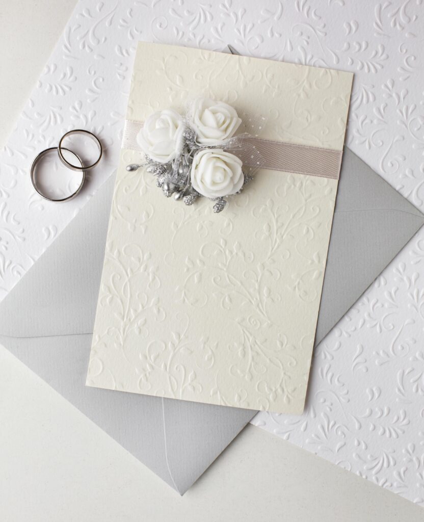

La invitación llega como un preludio, semanas antes, entra a una casa, se apoya en un refrigerador o en un espejo, y durante los meses que faltan para la boda repite en silencio lo mismo cada vez que alguien pasa cerca, "esto va a ser importante" Empiece por el papel, un gramaje de 300 a 350 gramos comunica solidez antes de que el ojo lea una sola palabra, el algodón absorbe la tinta de manera distinta al papel de celulosa y la letra queda hundida, esa hendidura es la razón por la que la impresión tipográfica, el letterpress, con tipos móviles sobre prensa, sigue respaldando su valor. Después la tipografía, utilice una sola familia de letras, dos como máximo, la caligrafía manual resuelve el nombre del invitado y nada más; usarla en el cuerpo del texto vuelve ilegible la dirección del banquete, que es la única información que la gente necesita releer. Los tiempos, el "Save the date" con seis a ocho meses de anticipación si la boda es de destino, cuatro si es local, invitación formal con ocho a diez semanas, confirmación cerrada un mes antes, porque el banquete cobra por plato servido y el planificador necesita un número. El error frecuente es cargar la invitación con instrucciones, el código de vestimenta, mapas, hoteles, mesa de regalos y hashtag no caben en una tarjeta y tampoco corresponden ahí, van en una hoja aparte, más pequeña, o en un sitio web cuya dirección se imprime al pie en cuerpo ocho. Una invitación bien hecha dice tres cosas: quién, cuándo, dónde, todo lo demás lo dice el papel.
How to Choose? The First Impression: Invitation Design An invitation arrives as a prelude, weeks before the wedding, it finds its place in a home, resting on a refrigerator door or propped against a mirror. For the months leading up to the ceremony, it quietly repeats the same message every time someone walks by: This is going to matter. Begin with the paper, a weight between 300 and 350 gsm conveys substance before the eye has read a single word, cotton paper absorbs ink differently than wood pulp paper, allowing the lettering to settle into the surface, that subtle impression is precisely why letterpress printing, produced with movable type on a traditional press, continues to command such enduring value. Then comes the typography. Choose one typeface family, two at the very most, hand calligraphy should be reserved for the guest's name and nothing more, using it for the body text only makes the reception address difficult to read, even though that is the one detail guests are most likely to revisit. Timing matters as well, send a save the date six to eight months in advance for a destination wedding, or four months ahead for a local celebration, mail the formal invitation eight to ten weeks before the event, and request final RSVPs one month before the wedding, because caterers charge by the plated meal and planners need an accurate guest count. The most common mistake is trying to fit too much information into the invitation itself. The dress code, maps, hotel recommendations, registry details, and wedding hashtag do not belong on the main card, It should appear on a separate, smaller enclosure or on a wedding website, with its address printed discreetly at the bottom in eight point type. A well designed invitation communicates three things: who, when, and where, everything else is conveyed by the paper itself.